Don’t miss Clinton Pratt’s presentation at NCKP 2023: The Piano Conference, From Solo to School, on July 26, 2023 from 1:30-2:20PM. Register for NCKP 2023 before May 1, 2023 to receive the early bird discount!
1. Have a clear call-to-action.
Don’t confuse prospective clients with too many things to do. Should they call you? Email you? Fill out the form? Book a lesson? Go to your Facebook page? Have one thing you want them to do, make that clear, and put it on every page.
2. Less is more!
French Designer Antoine de Saint-Exupery said “a designer knows he has achieved perfection not when there is nothing left to add, but when there is nothing left to take away.” Don’t overwhelm potential clients with too many things to read and look at. Have only 3-4 pages, with minimal text on each page.
3. Photos of happy students making music.
Photos of pianos and cozy waiting rooms are great, but people want to see other people! They want to know that your students are having a good time, so show smiling faces of happy customers.
4. “About” page: not a lengthy academic bio!
Honestly, most people don’t care about your credentials and lengthy resume. They just want to know that you’ll give them a good experience.
A designer knows he has achieved perfection not when there is nothing left to add, but when there is nothing left to take away.
Antoine de Saint-Exupery
On your about page, instead of a long boring biography, tell a story that people can relate to. Keep it personal, write in first person, and focus on what they will get.

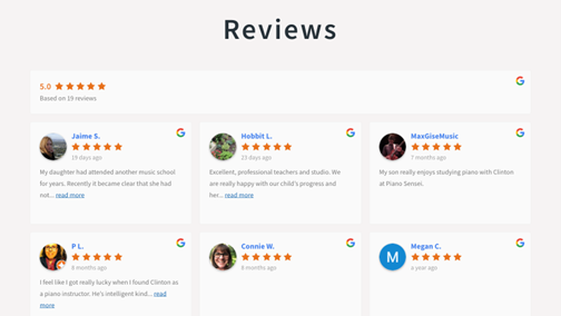
5. Reviews!
Social proof and credibility are important! If people see lots of positive reviews about your studio, they are much more likely to take the next step.

Other resources you might enjoy
- NCKP 2023: Register for NCKP 2023: The Piano Conference and attend Pratt’s session!
- PIANO MAGAZINE ARTICLE: How do you build, organize, and manage your website? by Heather Malyuk
- PIANO MAGAZINE ARTICLE: Social media, teacher directories, and websites: online marketing strategies for your piano studio by Steven Brundage
- WEBINAR ARCHIVE: Summer in Your Studio: How to Retain Your Students & Your Income with Sarah Buckley, Jennifer Foxx, Tony Parlapiano, & Clinton Pratt
- VIDEO: Inside the Studio with Clinton Pratt
- Use our search feature to discover more!